June 25, 2026
Candlestick Charts in Trading
Every candle graph on a price tells a story, who was in control during that period, how hard they pushed, and where things ended up. Candlestick charts (often called candle charts) are a financial chart used to display an asset’s price movements over time, giving visual insight into market sentiment and the synergy between buyers…
By Jess Lei
Scan this article:
Every candle graph on a price tells a story, who was in control during that period, how hard they pushed, and where things ended up.
Candlestick charts (often called candle charts) are a financial chart used to display an asset’s price movements over time, giving visual insight into market sentiment and the synergy between buyers and sellers. They’re the go-to chart type for traders and investors across stocks, forex, and crypto.
What are candlestick charts?
Candlestick charts originated in 18th-century Japan, where rice traders used them to track price sentiment over time. Today they may be the most common default chart view on most trading platforms because they pack more information into a single visual than a line chart can.
Each candlestick represents one specific time period. This could be one minute, one day, or one week, depending on the timeframe selected. In that single shape, you get four data points: the opening price, the closing price, the high, and the low.
Anatomy of a candle
A candle has two parts: the body and the wicks (also called shadows). The diagram below shows the key components.
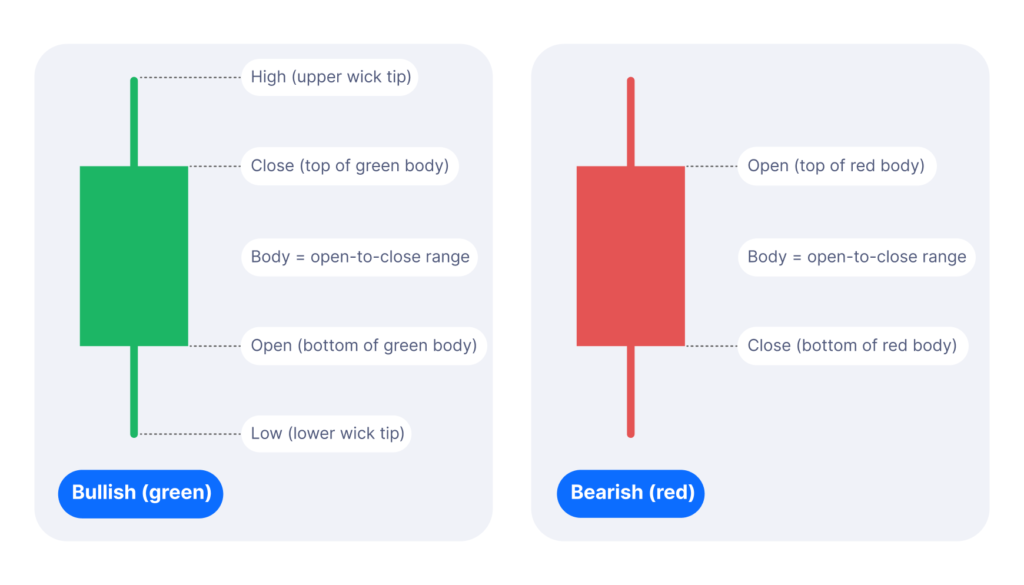
The real body shows the gap between where the price opened and where it closed. A green (bullish) candle closed higher than it opened, meaning buyers had the upper hand during that period. A red (bearish) candle closed lower than it opened, meaning sellers dominated.
The wicks show the full range of price movement. A long upper wick means price pushed significantly higher during the period but was then sold back down before close. A long lower wick means the price dropped hard but recovered. Wicks show where the market tested a level and rejected it.
The longer the wick relative to the body, the more contested that price level was. A small body with long wicks on both sides can signal indecision, where neither buyers nor sellers gained clear control.
Single candle patterns
Certain candle shapes repeat frequently enough that traders give them names. They are not signals on their own. They are observations that may be worth noting, particularly when they appear at key support or resistance levels alongside other analysis.

Two-candle patterns:
Some commonly observed signals come from reading pairs of candles together. Context matters significantly here: the same pattern in a downtrend carries different implications than the same pattern in an uptrend.
- Bullish engulfing: A small red candle followed by a larger green candle that fully covers it. Often observed near the end of a downtrend suggesting buyers may have stepped in with conviction.
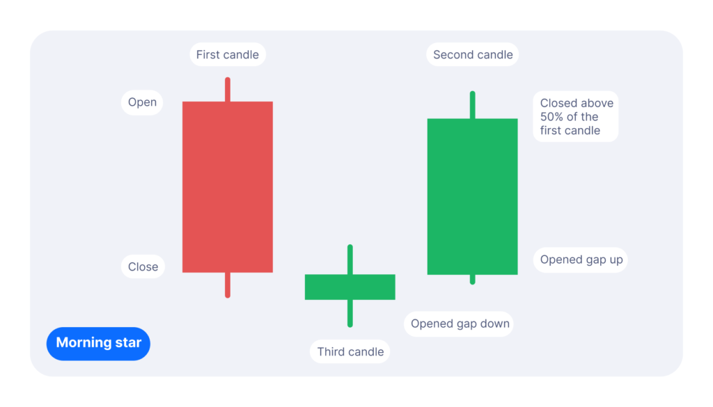
- Morning star: Three candles: a large red, a small indecisive body, then a large green, A pattern sometimes associated with market bottom, where uncertainty is followed by a decisive shift upwards.
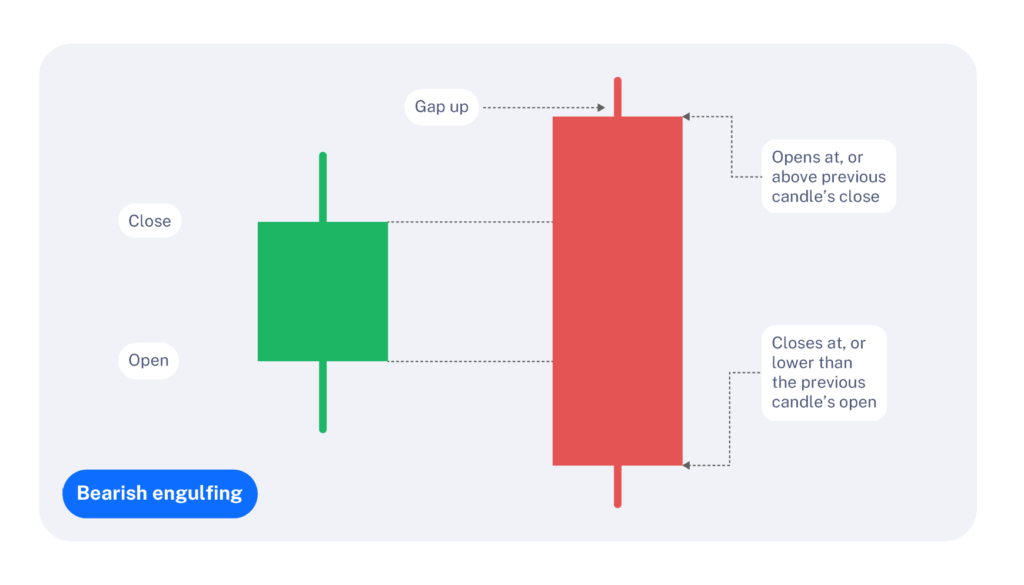
- Bearish engulfing: a small green candle followed by a large red candle that fully covers it. Often observed near the end of an uptrend, suggesting sellers may have taken control
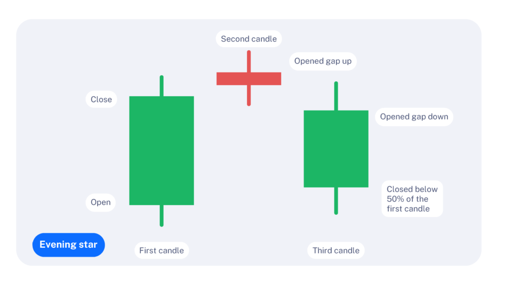
4. Evening star: the inverse sequence: a large green, a small body then a large red. A pattern sometimes associated with a market top, where upwards momentum stalls and reverses.

How to use candle stick charts on Superhero:
Candlestick patterns are most useful as one input within a broader analysis, not as standalone trade triggers. A bullish engulfing candle at a well-established support level is an observation used by some traders, but it carries more weight than the same pattern appearing in the middle of a range with no supporting context.
On Superhero, candlestick charts are available for any asset with at least 1 month of trading history. Candles are plotted daily, giving you a clean view of price action without the noise of shorter timeframes. A few features worth knowing:
- Use the navigator at the bottom of the chart to zoom in on a specific date range, which is useful when a chart is dense and you want to focus on a particular period.
- Hover the crosshair tool to read the exact OHLCV data (open, high, low, close, and volume) for any individual candle.
A few practical considerations:
- Check the timeframe. A hammer on a one-minute chart is likely noise. On a weekly chart, it reflects a greater volume of market participants and may carry more significance.
- Look at the wick-to-body ratio. A large body with small wicks points to conviction, where price moved in one direction and held. Large wicks with a small body suggest an unresolved struggle between buyers and sellers.
- Volume adds context. A reversal candle that appears on high volume has more supporting evidence than the same candle on thin volume. Neither is a guarantee of what comes next.
Candlesticks do have limitations. Their predictive power is mostly limited to the short term. Use them alongside trend analysis, volume, and support and resistance levels to build a more complete picture of market conditions before making any decision.
Frequently asked questions:
Q: What do candlestick charts show?
A candlestick chart displays historical price movements over specific time intervals, detailing the open, close, high, and low prices. This allows investors to visually track past market momentum between buyers and sellers.
Q: How do you read a candlestick chart for beginners?
Start with the color: green means price went up, red means it went down. Then look at the body size — a big body means a strong move, a small body means indecision. Finally check the wicks: long wicks show price tried to move further but got pushed back. Reading those three things on each candle tells you the basic story of what buyers and sellers did during that period.
Q: What is the most reliable candlestick pattern?
The engulfing pattern is widely considered one of the most reliable, especially on daily or weekly charts. It occurs when one candle’s body completely “swallows” the previous candle’s body — a bullish engulfing signals strong buying momentum taking over from sellers, and a bearish engulfing signals the opposite. Reliability increases when the pattern appears at a known support or resistance level.
Superhero Markets Pty Ltd (ABN 36 633 254 261) is a Corporate Authorised Representative (CAR 1276309) of Superhero Securities Limited (ABN 96 160 456 315) (AFSL 430150).
Please read and understand our Financial Services Guides, Terms & Conditions, Privacy Policy and Website Terms of Use at superhero.com.au/support/documents, before deciding to use or invest on Superhero. We do not provide financial advice that takes into consideration your personal objectives, financial situation or particular needs. All investments carry risk, so please consider carefully before making any investment decisions and seek independent financial advice. Past performance is not indicative of future performance. Pictures, charts and graphs are provided for illustrative purposes only.
Copyright © 2026 Superhero

Become a part of
our investor community
Why you should join us:
- Join free and invest with no monthly account fees.
- Fund your account in real time with PayID.
- Get investing with brokerage from $2. Other fees may apply for U.S. shares.
Read our latest articles
Make knowledge your superpower and up your skills and know-how with our news, educational tools and resources.